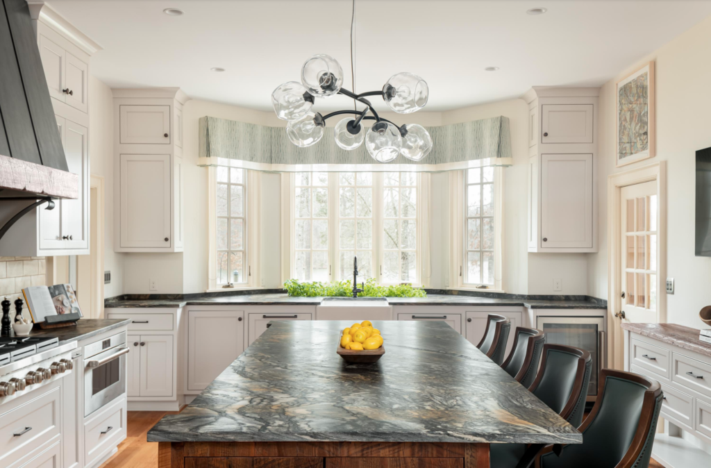
Project: Manakin Sabot Kitchen
Designer: Kathy Corbet Interiors
The Story:
The homeowners were about to become empty nesters. Their home had clearly become the family gathering place and updating the kitchen to create separate areas for grazing, beverage access, cooking, prep and clean up were needed.
Client Needs and Wants:
The client did not like the appliance locations. There was too much crowding near the refrigerator, coffee maker and cooktop. The eat-at island was right on top of the cooking and prep area. And her husband wanted a wine serving/tasting area. There was a bizarre utility closet behind one wall under a staircase adjacent to the kitchen that seemed like it could be useful. They wanted the dining room more open to the kitchen. There was a traffic jam of doors between the kitchen and the mudroom. A big, beautiful bay window that looks out on the lake was a highlight but the existing cabinets followed the contour of the bay and created a series of awkward angles and unusable cabinet space. The herb garden was beyond reach
outside on the patio.
This client was very interested in healthy cooking. Their main beverage of choice is filtered water. The refrigerator was never big enough. She uses fresh herbs in every meal. She likes having a built in coffee/espresso machine but wanted one that was less maintenance.
Before Floorplan
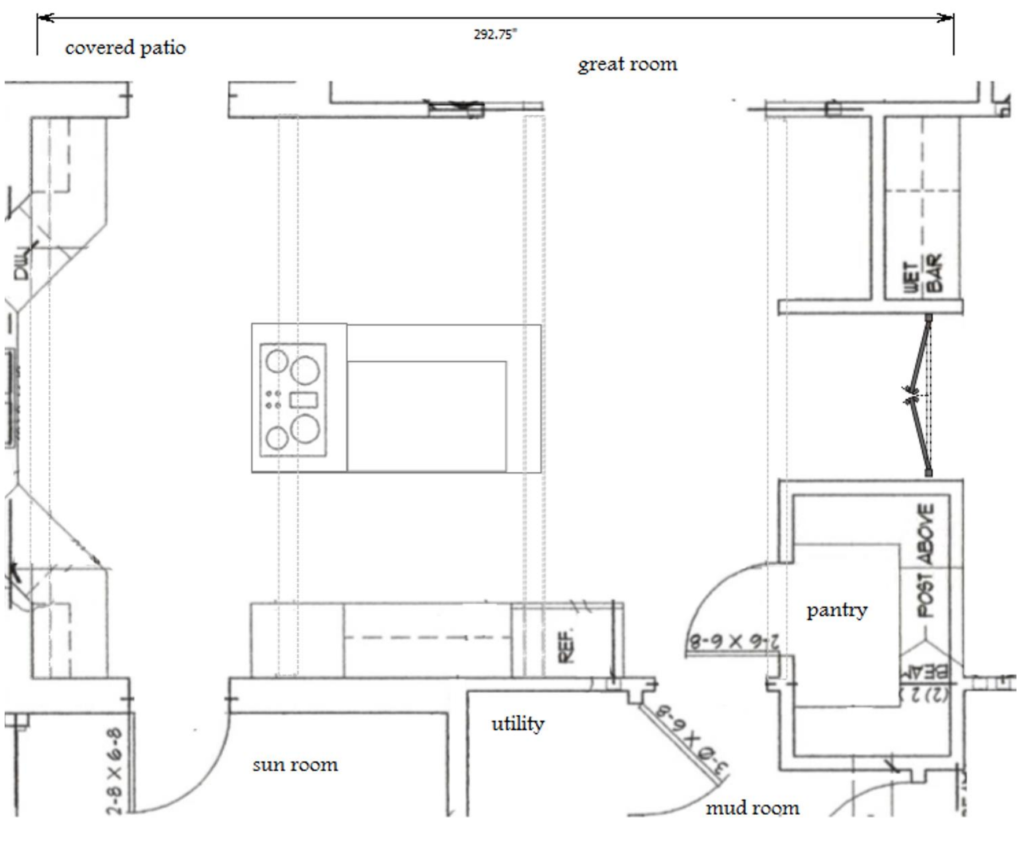
- Bay window let in great light, but angles created awkward and unusable cabinets
- A 5’ “hallway” separated the kitchen from the dining
- Four doors within three feet created an obstacle course between the kitchen and
- mudroom
- With cooking at the island, everything was crowded into a small space
After Floorplan
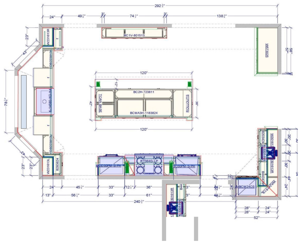
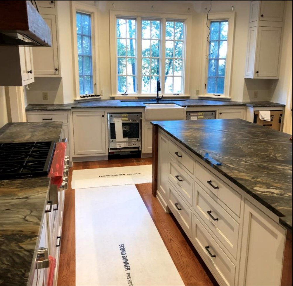
- Cabinets were pulled straight at the bay and the additional space was used to bring the herb garden inside with a custom herb sink
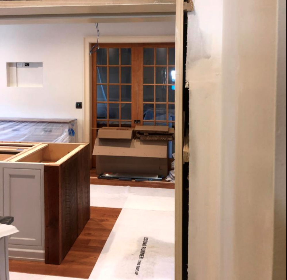
- Walls were removed and the kitchen was expanded to connect it to the dining room. 8’ tall glass pocket doors maintain light and openness to the dining while allowing for privacy
- A hidden pocket door was tucked behind the existing kitchen wall.
- A barn door was installed in front of the former utility closet which became a well-planned pantry
- The cooktop was moved to a long wall and was designed to be a focal point in
- the room. The island was expanded and all seating moved to one side to keep the prep area clear of bystanders and grazers.
Before Construction Photos
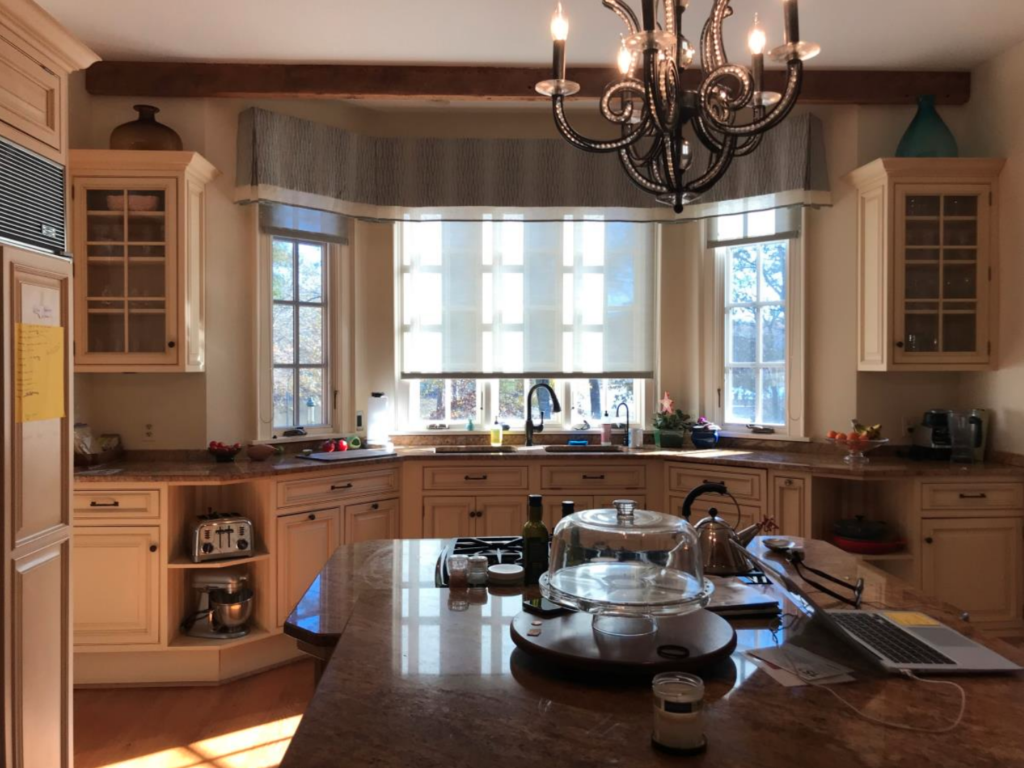
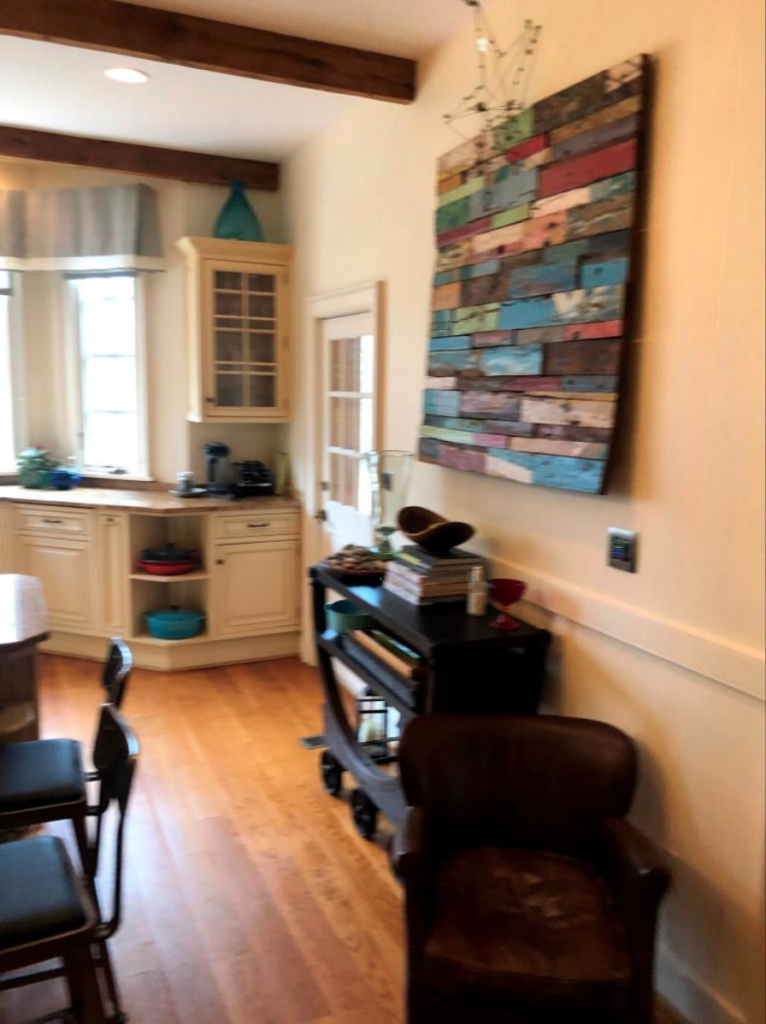
- Bay window let in light, but angles created awkward and unusable cabinets
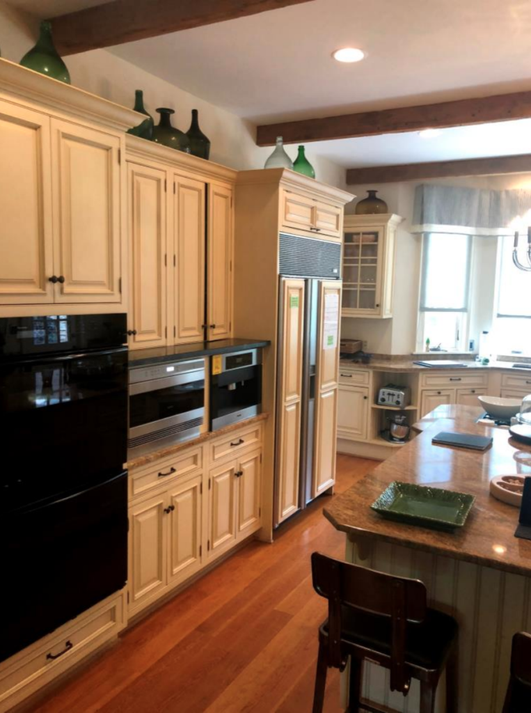
- With cooking at the island, everything was crowded into a small space
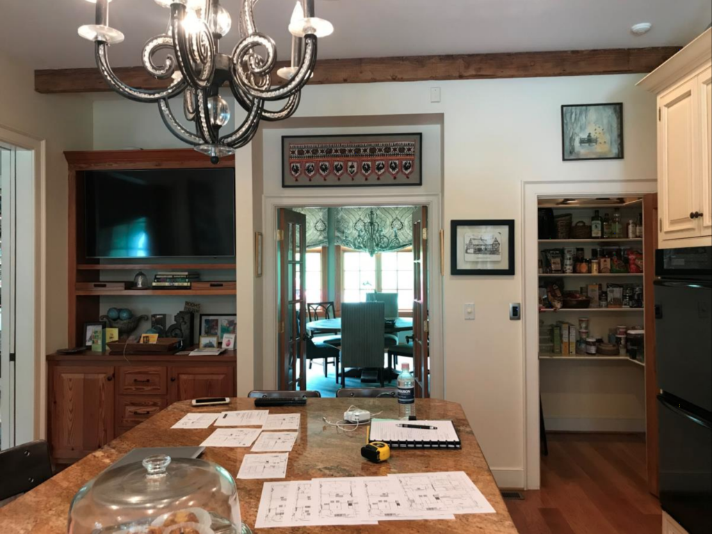
- A 5’ “hallway” separated the kitchen from the dining
- Four doors within three feet created an obstacle course between the kitchen and mudroom
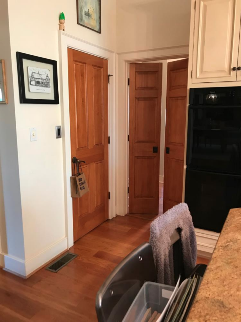
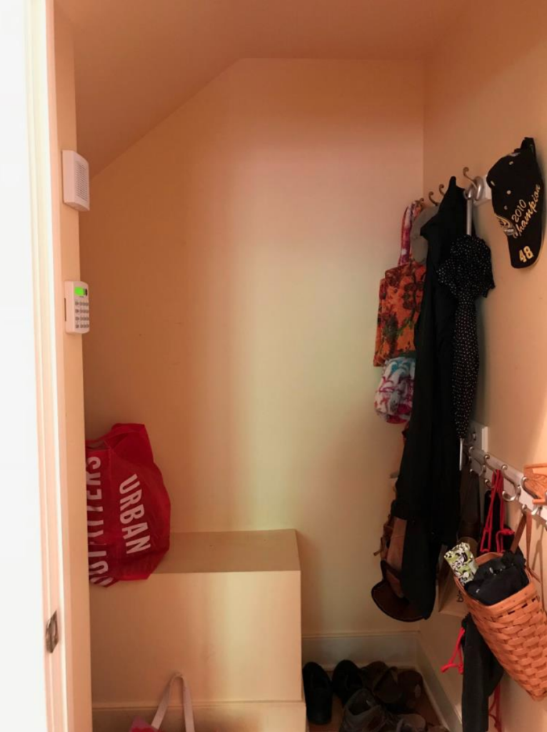
- Four doors within three feet created an obstacle course between the kitchen and mudroom
- An existing utility space was difficult to access and awkward
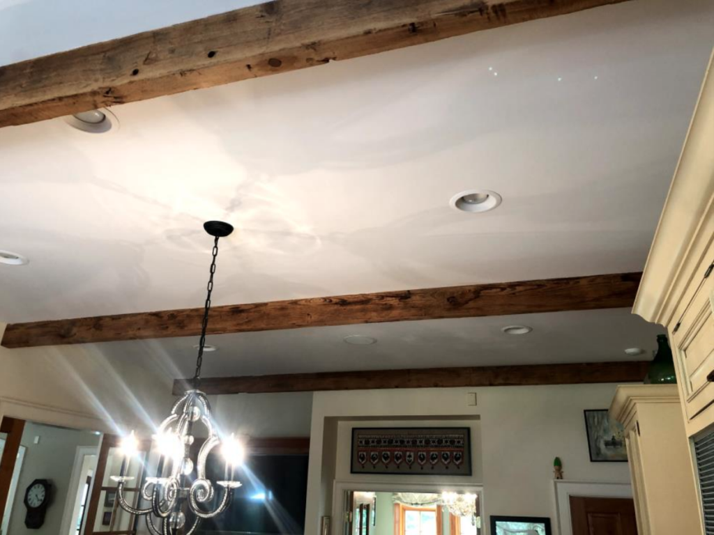
- The client loved the original wood beams in the home and hoped to be able to repurpose them in some way
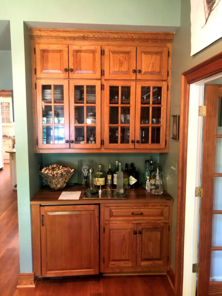
- The wine bar was located outside of the kitchen and was not within the entertainment area. The wine fridge would be repurposed in the updated pantry for overflow storage
- The “T” shaped island did not leave enough room on the far wall for any substantial storage use
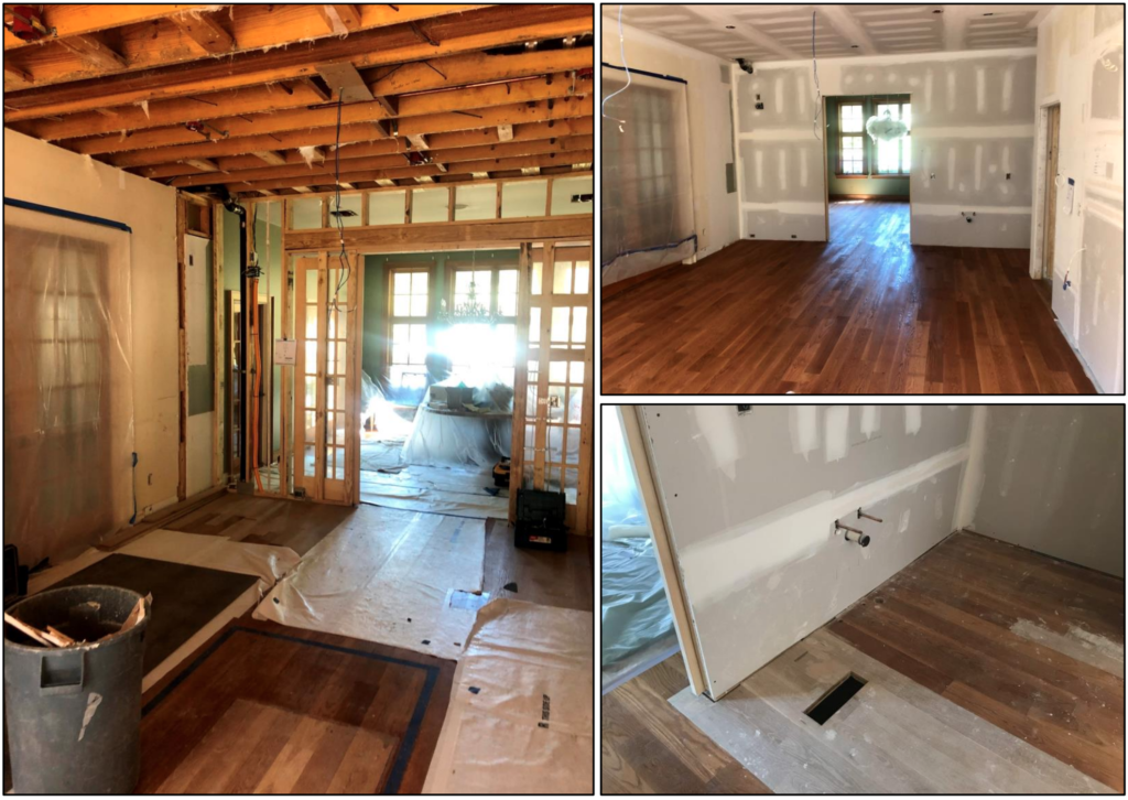
Construction Photos
Finished Project
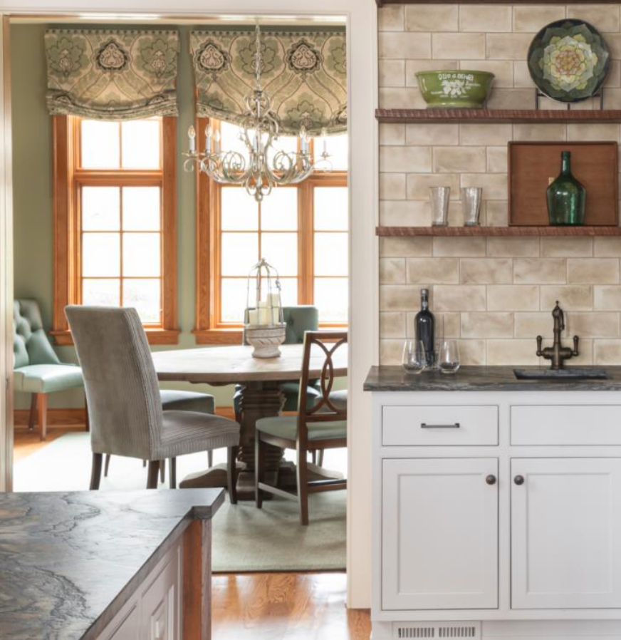
- Open connection to the dining room
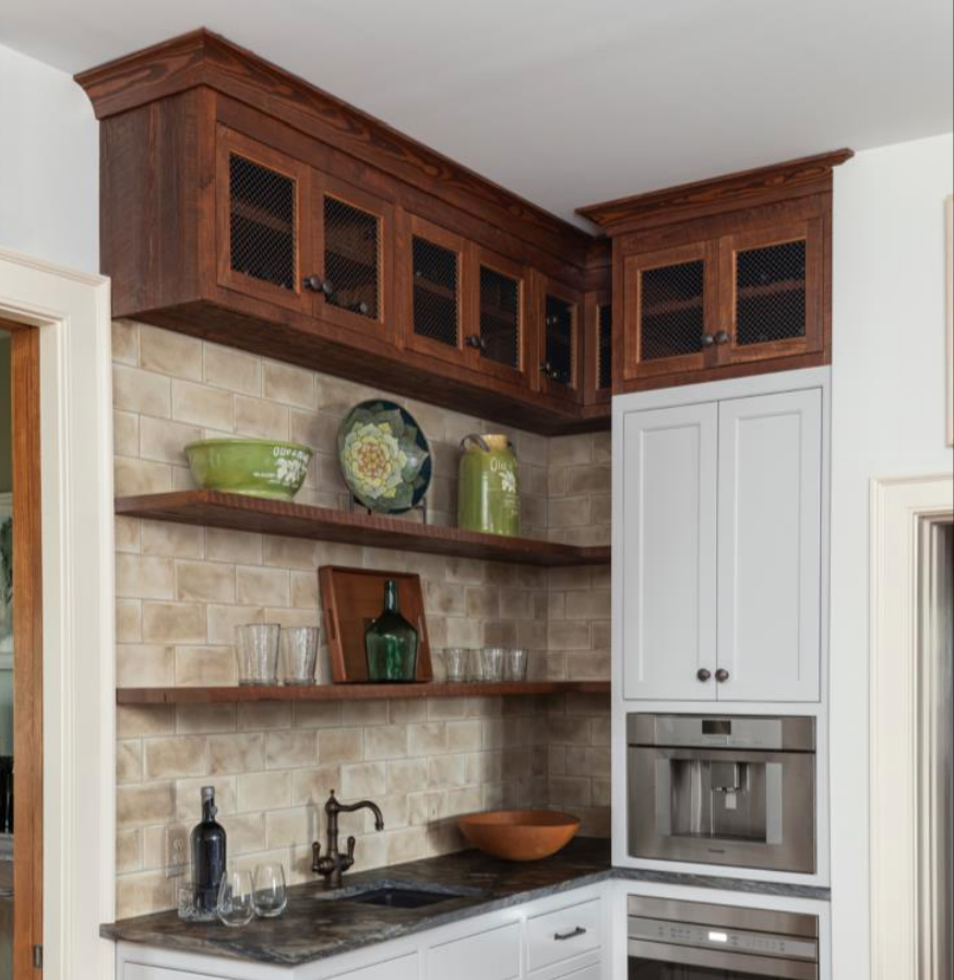
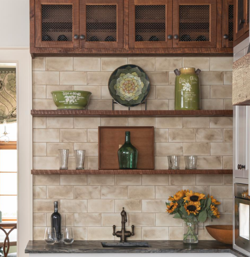
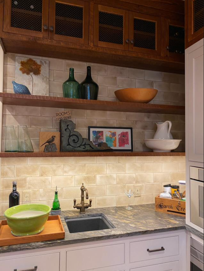
- Filtered water and coffee bar connected to the kitchen
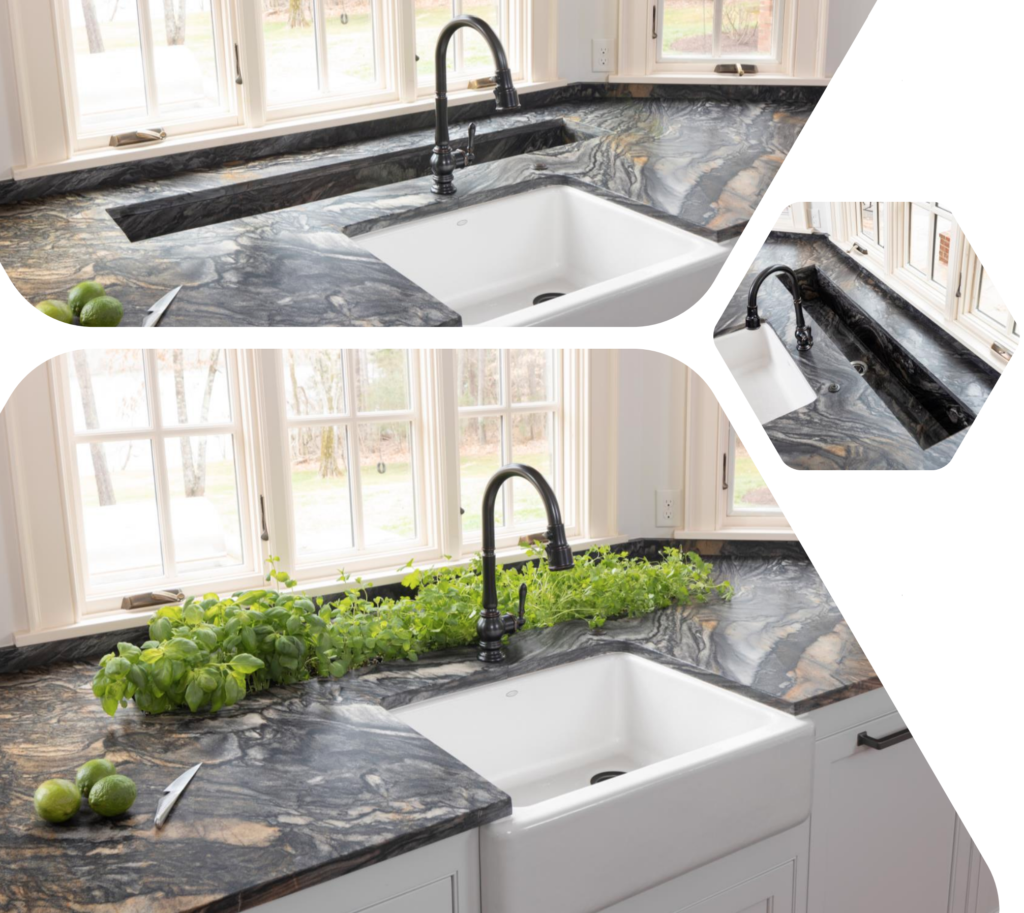
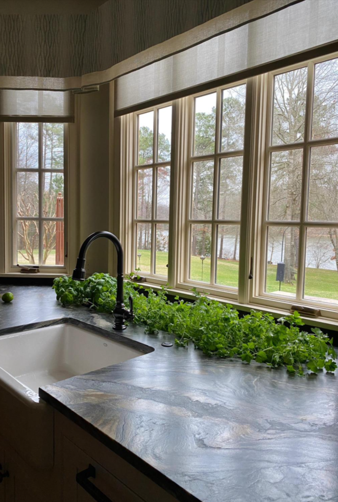
- Year-round herb garden
- Herb sink appears seamlessly “carved” into the kitchen top
- The trap has extra filtration and is also flushed by the forced water of the dishwasher to ensure no sediment build up

Clients’ Wants & Needs
There was too much crowding near the refrigerator, coffee maker and cooktop. The eat-at island was right on top of the cooking and prep area. And her husband wanted a wine serving/tasting area. They wanted the dining room more open to the kitchen. There was a traffic jam of doors between the kitchen and the mudroom. A big, beautiful bay window that looks out on the lake was a highlight but the existing cabinets followed the contour of the bay and created a series of awkward angles and unusable cabinet space. The herb garden was beyond reach outside on the patio.
Goals included:
- Better and more open connection to the dining room
- Lots of counter space and an Island that allowed for comfortable gathering
- Re-use existing beams and reclaimed wood
- Year-round herb garden integrated into the kitchen
- Dedicated space for filtered water, wine, and coffee
- Eliminate the maze of doors and create better “flow.”
Functional Improvements
- To address the healthy cooking we specified the Wolf steam oven and created an interior herb garden.
- The extra deep space beyond the sink was turned into a custom-built trough sink that allowed us to bring the herb garden inside.
- We included two dishwashers to keep counter tops clear and clean when cooking for her large family.
- We went with the integrated sub zero column 30” refrigerator and 24” freezer.
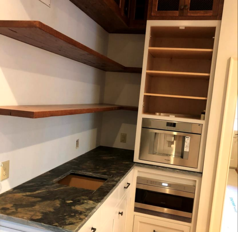
- The coffee maker is a Thermador model that is plumbed for ease of use.
- The Rohl bar filter faucet is at the beverage center.
- We did an undercounted beverage center near the porch door for easy access to cool beverages from outside.
- The sink cabinets are taller for more comfortable use with the taller clients
Aesthetic Improvements
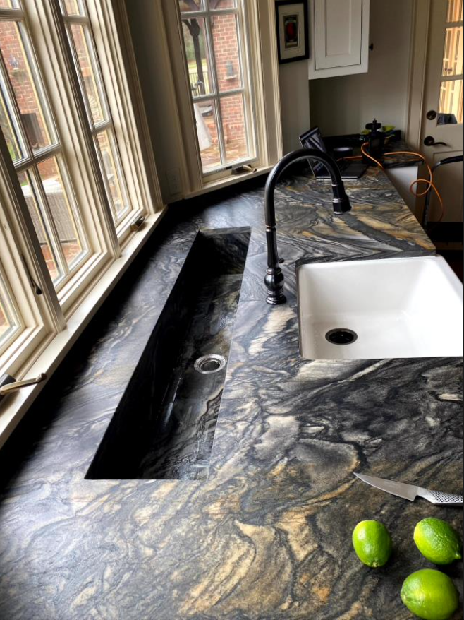
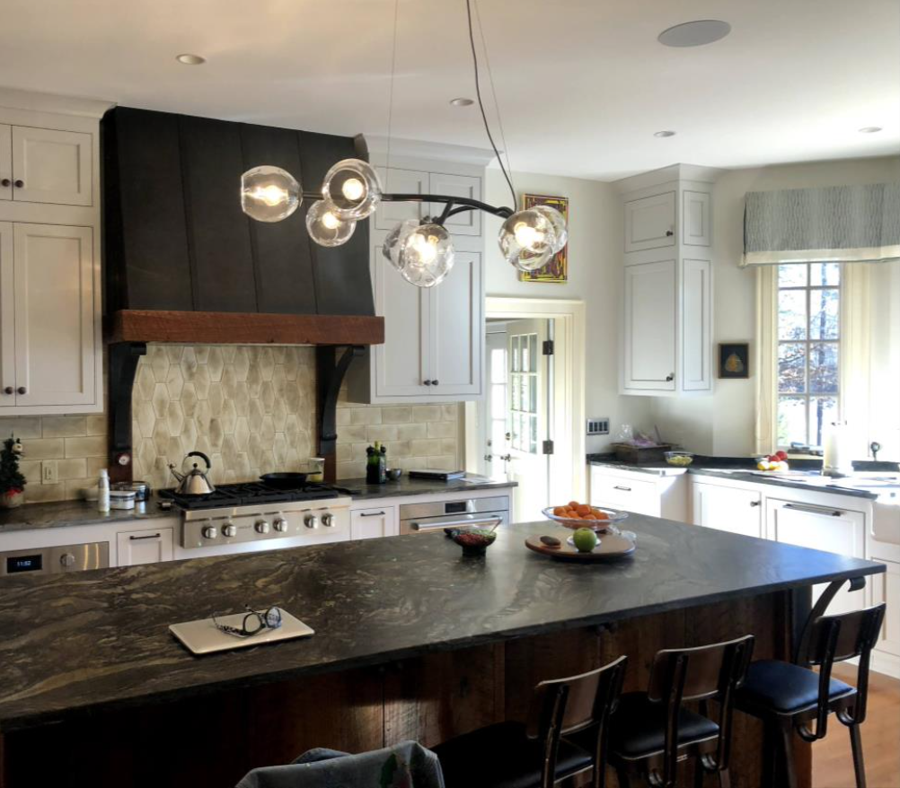
- The counter tops are “Fantasy Black Leathered”. Used on all surfaces and to fabricate the plant trough.
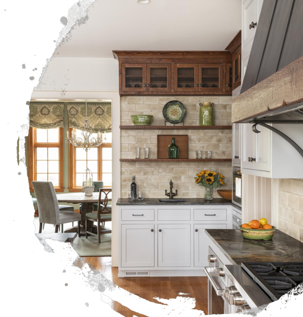
- The wine storage doors have wire mesh inserts in lieu of glass for a refined rustic look.
- The majority of the cabinet are painted “Balboa Mist” from Benjamin Moore to keep it all light and bright.
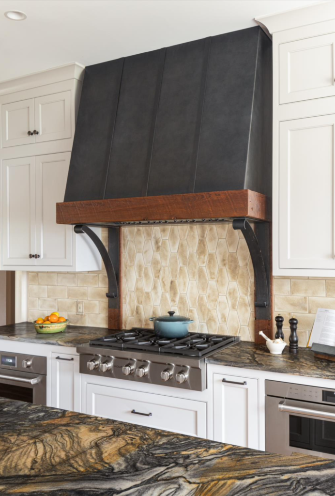
- The backsplash is hand glazed subway tile; an elongated hexagon shape was used with the same finish for a subtle accent at the cooktop.
- The light fixture is functional art in the room. ThisisdesignedbySimon Pearce in Vermont.
Superior Craftmanship
- An ingenious configuration of pocket doors reduced the door congestion to the mudroom and new little pantry.
- The herb garden sink was cut out of the same fantasy black leathered stone with consistent veining to create the feeling that the sink is cut from a 10” thick slab.
- The herb sink was designed with an extra deep basket strainer to collect leaves and dirt, but for any that get through, the dishwasher was piped into the same trap to flush through any debris on a regular basis and prevent any sediment build-up.
- The barn door was site built by in-house carpenters out of reclaimed original floorboards.
- The legs of the island, shelving, and wood accents on the hood were made from the reclaimed beams harvested from the original kitchen during demolition.
- Custom metal hood and brackets were made to highlight the natural wood and surrounding tile
Innovative Materials & Methods
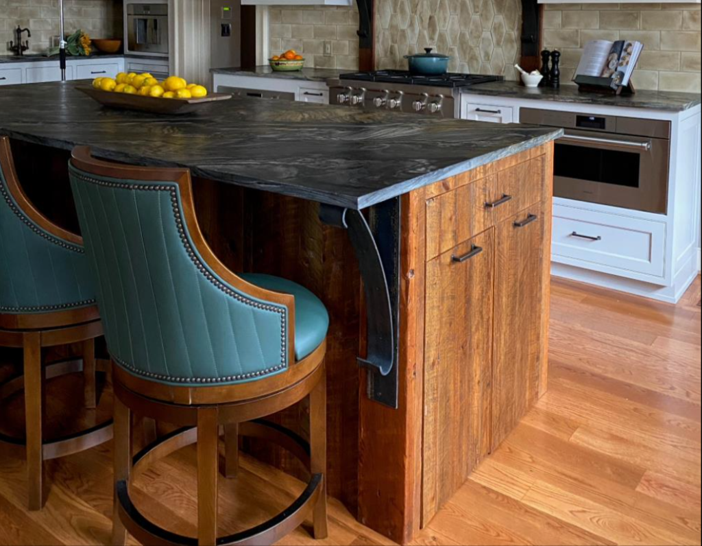
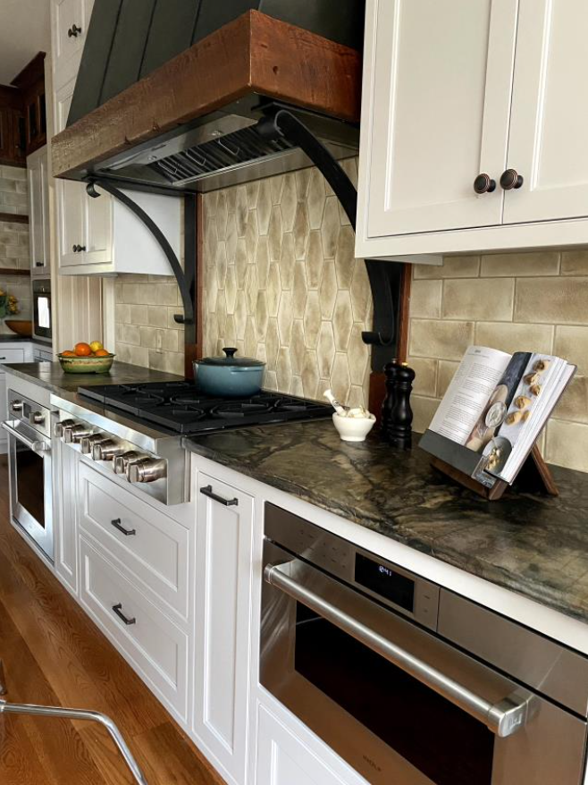
- The range hood, corbels and island corbels are all custom made by a local metal worker.
- Aged wood is throughout the house and by repurposing and working them into the kitchen design we remained true to the aesthetic of the home.
- The beams were carefully removed during demolition, milled, and reconfigured as display shelves at the beverage center, as “legs” at the island and as supports and the surround for the custom range hood and corbels. The cabinet maker matched that wood for three sides of the island and for the wine storage cabinets at the very top of the beverage center.
Overcoming Obstacles
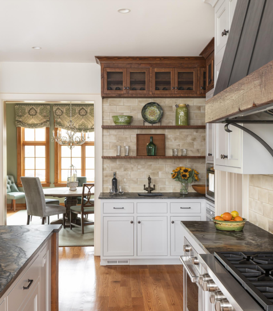
We realized that we could get the entire sink run of countertop in just two large pieces, but this would eat up an additional slab. We had already reserved all available slabs of the lot; however, we were able to find a fabricator three states away who had a slab from the same lot. They agreed to sell us the slab and we sent someone to pick it up. We could have done the top with additional seams, but the full top now feels like a continuous run with consistent veining.
The adjoining dining room is an original stain grade pine and the owner loved the patina of the original trim. We identified reclaimed wood of a similar vintage and worked through 11 different stain samples to come up with a stain that even the homeowner could not differentiate from the original.
